Using Navigators and Rubberbands (AJAX Controls)
BitmapViewer control can be used not only to display the image at the screen. Using special controls it can process user input at the displayed image. For example, it can zoom an image at mouse click, pan it on mouse move, or select a portion of the image. These controls are called controllers. There are two kinds of controllers - navigators and rubberbands.
Navigator is a control which specifies user to navigate on the image (scroll, or zoom). For example, this control can zoom the image in by the mouse click (ZoomInNavigator). To associate it with the BitmapViewer, you should use the Navigator property.
Rubberband is a geometric shape which can be added to the BitmapViewer, moved, or resized. Graphics Mill for .NET currently supports only the rectangle rubberband. To associate a rubberband with the BitmapViewer, use the Rubberband property.
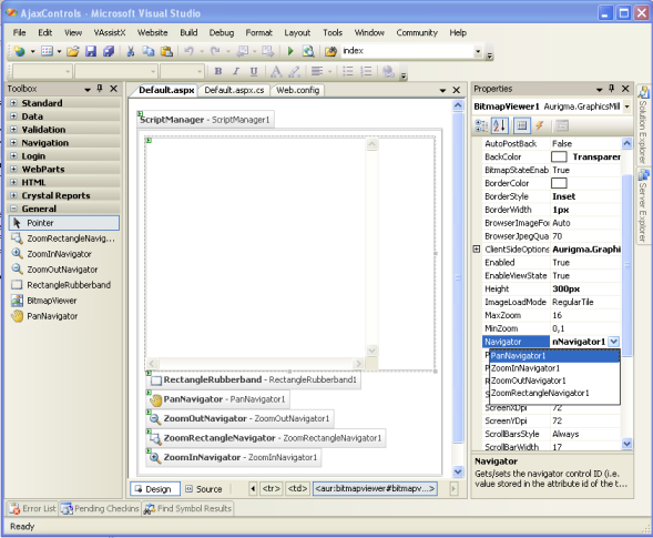
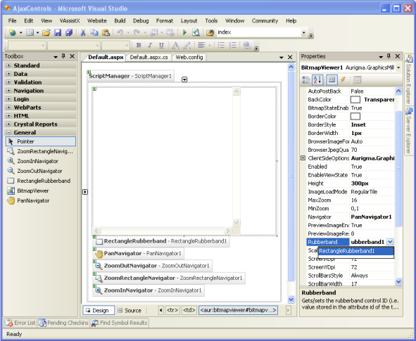
You can associate an user input controller to the BitmapViewer in design time in the following way:
- Find necessary controller at the component toolbox (it should be near the BitmapViewer).
- Drag it at the form.
- Open properties of the BitmapViewer.
- Change the property Navigator to the appropriate navigator control ID and the property Rubberband to the necessary rubberband control ID.
It should be looking similar to the following screenshots:
You can also modify these properties in the run-time. It is convenient when you are creating the toolbar.
Graphics Mill for .NET is shipped with the following controllers:
-
 PanNavigator
- this control is responsible for
image panning when mouse left button is pressed and mouse moved.
PanNavigator
- this control is responsible for
image panning when mouse left button is pressed and mouse moved. -
 ZoomInNavigator
- this control is responsible
for zooming the image in when user clicks the mouse button at some image point. The portion
of image user clicked at is centered.
ZoomInNavigator
- this control is responsible
for zooming the image in when user clicks the mouse button at some image point. The portion
of image user clicked at is centered. -
 ZoomOutNavigator
- this control is
responsible for zooming the image out when user clicks the mouse button at some image
point. The portion of image user clicked at is centered.
ZoomOutNavigator
- this control is
responsible for zooming the image out when user clicks the mouse button at some image
point. The portion of image user clicked at is centered. -
 ZoomRectangleNavigator
- this
control is a combination of the RectangleRubberband and the ZoomInNavigator. When user presses
mouse button and start dragging, selection is drawn. When mouse button is released, the
image is zoomed to display the selected image portion only.
ZoomRectangleNavigator
- this
control is a combination of the RectangleRubberband and the ZoomInNavigator. When user presses
mouse button and start dragging, selection is drawn. When mouse button is released, the
image is zoomed to display the selected image portion only. -
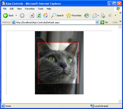
 RectangleRubberband
- this control is
responsible for drawing rectangular selection at the image. You can also edit the rectangle
(move or resize). Rectangle resizing may be restricted by fixed proportions which is useful
when it is used for cropping selection.
RectangleRubberband
- this control is
responsible for drawing rectangular selection at the image. You can also edit the rectangle
(move or resize). Rectangle resizing may be restricted by fixed proportions which is useful
when it is used for cropping selection. -
VObjectsRubberband
- this control is
responsible for adding vector objects to the image.