Displaying Image in BitmapViewer (AJAX Controls)
To display an image in your web application you can use BitmapViewer AJAX control, which provides you with more advanced functionality in comparison with a standard image output. This article demonstrates just a few of BitmapViewer features and describes all aspects associated with displaying an image.
Loading Image in the BitmapViewer
To load image to the BitmapViewer you can use the Bitmap property, which associates the image you want to display in the control with the Bitmap object. This class provides the Load method which allows you to load the image from external source. The most appropriate event handler this method can be called from is the Page_Load. In this case the BitmapViewer will send the image to a client on every page load. However, the page loads (and this event fires) not only when you open the page but on every postback too. Therefore, you should additionally check whether a postback occurred and call the Load method if it did not. Otherwise, you may loss all modifications applied to the image before.
Protected Sub Page_Load(ByVal sender As Object, ByVal e As System.EventArgs) Handles Me.Load
    If Not Page.IsPostBack Then
        BitmapViewer1.Bitmap.Load(Server.MapPath("cat.jpg"))
    End If
End Sub
protected void Page_Load(object sender, EventArgs e)
{
    if (!Page.IsPostBack)
    {
        BitmapViewer1.Bitmap.Load(Server.MapPath("cat.jpg"));
    }
}
Image Displaying Modes
When an image is loaded to the BitmapViewer on server,
it sends this image to a client. Depending on image size it may require some time. So, you can load an original image in two ways:
by sending the image entirely or loading a low resolution preview before the original image is delivered to a client, that gives user a concept of the image.
If the PreviewImageEnabled property is true
the control generates and sends a preview image to a client. Its dimensions are calculated by
dividing height and width of the original image by the PreviewImageResizeRatio
property value.
For example, if this value is 8 the height and width of the preview image will be in 8 times smaller comparing to the original image.
The preview image is stretched in the entire control area (including invisible parts) that
allows user to navigate pixelated image inside the control. In other words, this preview
is used like a background of control which will be covered with necessary fragments of the original image.
If this property is set to false a user will see only a preset background until necessary fragment is loaded from server.
In addition to a preview the BitmapViewer allows to load an original image to a client in three modes. To specify a load mode you should use the ImageLoadMode property, which can be set to one of the following values:
Entire
BitmapViewer1.ImageLoadMode = Aurigma.GraphicsMill.AjaxControls.ImageLoadMode.Entire
BitmapViewer1.ImageLoadMode = Aurigma.GraphicsMill.AjaxControls.ImageLoadMode.Entire;
Whole original image is loaded including all invisible parts.
Note if the PreviewImageEnabled
property is true, the image is loaded in the similar manner as a progressive Jpeg loading.
Adaptive Tile
BitmapViewer1.ImageLoadMode = Aurigma.GraphicsMill.AjaxControls.ImageLoadMode.AdaptiveTile
BitmapViewer1.ImageLoadMode = Aurigma.GraphicsMill.AjaxControls.ImageLoadMode.AdaptiveTile;
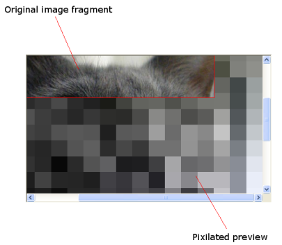
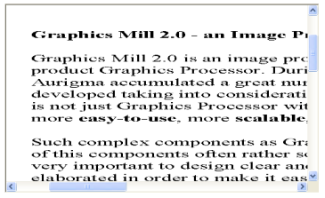
First of all, the control loads image fragment actually visible in the client area. Then, if an user scrolls the image it loads necessary parts of an original image which are visible but not loaded yet. This load mode is looking similar to this screenshot:
Regular Tile
BitmapViewer1.ImageLoadMode = Aurigma.GraphicsMill.AjaxControls.ImageLoadMode.RegularTile
BitmapViewer1.ImageLoadMode = Aurigma.GraphicsMill.AjaxControls.ImageLoadMode.RegularTile;
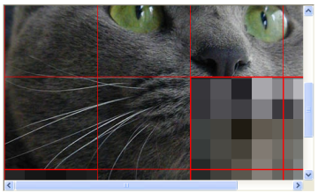
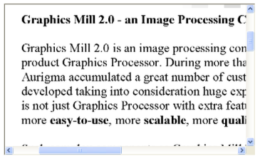
In this mode the original image is divided into square tiles. The tile size equals to TileSize property value. The control loads square fragments of the original image for corresponding tiles which are visible but not loaded yet. This load mode is looking similar to this screenshot:
How to Choose an Image Load Mode
If you are not going to change or modify the displayed image frequently you should use the Entire mode. In this case you increase an image load time and get a completely loaded image which can be scrolled without additional delays. If AdaptiveTile or RegularTile mode is used you will get the image inside the control significantly faster than in the Entire mode. But when you scroll the image you will need to wait untill the necessary fragment is loaded. AdaptiveTile mode allows to optimize a traffic by loading only actually visible parts of the displayed image. But it requires more server resources comparing to RegularTile mode.
Positioning Image in the BitmapViewer
The BitmapViewer allows to align the displayed image in different ways using the ViewportAlignment property.
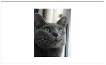
As an example, you can set this property to the CenterCenter value and position the image to center horizontally and to center vertically:
BitmapViewer1.ViewportAlignment = Aurigma.GraphicsMill.AjaxControls.ViewportAlignment.CenterCenter
BitmapViewer1.ViewportAlignment = Aurigma.GraphicsMill.AjaxControls.ViewportAlignment.CenterCenter;
If you execute the code snippet above you will get the control looked like this screenshot:
You can find the full list of available alignmnet modes in the ViewportAlignment enumeration.
Zooming Image in the BitmapViewer
Zoom Modes
There are two zoom modes provided by BitmapViewer: manual and automatic. Alternatively you can associate some zooming navigator control, which will zoom the image on the mouse click. You can get more information about it in the topic Using Navigators and Rubberbands (AJAX Controls).
Manual Zoom
In this mode user sets zoom value manually by modifying Zoom property. Its value is measured in percents divided by 100: if value is 1 it specifies 100% zoom (i.e. actual size). If value is greater than 1 the image is stretched, otherwise it will be shrunk. The following code snippets demonstrate how the manual zoom can be set:
BitmapViewer1.Zoom = 2
BitmapViewer1.Zoom = 2;
The code snippet above stretches the image in two times (i.e. 200% zoom). The following example demonstrates how the image can be shrunk in two times:
BitmapViewer1.Zoom = 0.5F
BitmapViewer1.Zoom = 0.5F;
Maximum and minimum values of zoom can be restricted by MaxZoom and MinZoom properties.
Automatic Zoom
In this mode the BitmapViewer calculates optimal zoom value automatically depending on the ZoomMode property. The following modes of automatic zoom are available:
- None. Automatic zoom is disabled. Manual mode is used.
- BestFit. The image covers maximum area of the control by stretching or shrinking. If image is smaller than the control client area, the image is stretched to occupy as much area as possible otherwise the image is shrunk.
- BestFitShrinkOnly. The image covers maximum area of the control by shrinking only. If image is smaller than the control client area, 100% zoom is used.
- FitToWidth. The image fits the control horizontally by stretching or shrinking. If the image width is smaller than the control client area width, image is stretched otherwise the image is shrunk.
- FitToHeight. The image fits the control vertically by stretching or shrinking. If the image height is smaller than the control client area height, image is stretched otherwise the image is shrunk.
- FitToWidthShrinkOnly. The image fits the control horizontally by shrinking only. If image width is smaller than the control client area, 100% zoom is used.
- FitToHeightShrinkOnly. The image fits the control vertically by shrinking only. If image height is smaller than the control client area, 100% zoom is used.
- ZoomControl. The control dimensions are changed automatically regarding to image size. So control size will equal to size of loaded image.
If automatic zoom (except ZoomControl) mode is used and you attempt to change zoom value manually, ZoomMode property will be set to None.
Using Scrollbars
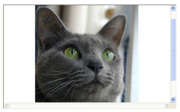
When you zoom the image in it can exceed the control client area. If so, you can use scrollbars to navigate the image. The BitmapViewer has the ScrollBarsStyle property which specifies a scrollbars appearance. If this propety is set to Always value:
BitmapViewer1.ScrollBarsStyle = Aurigma.GraphicsMill.AjaxControls.ScrollBarsStyle.Always
BitmapViewer1.ScrollBarsStyle = Aurigma.GraphicsMill.AjaxControls.ScrollBarsStyle.Always;
Scrollbars will be always displayed but they will be inactivate if an image is smaller than the control area:
Another possible value of the ScrollBarsStyle property is Auto, which displays scrollbars only in the case when an image exceeds the control area.
Resize Quality of Zoomed Image
The image can be zoomed with different quality (High, Medium, Low and ShrinkHighStretchLow). If it is zoomed with low quality, the performance is higher, and vice versa. You can set the quality value by using ZoomQuality property. We recommend to use the ShrinkHighStretchLow zoom quality because it provides more natural results in most cases.
Format and Quality of the Displayed Image
You are able to specify format of tiles which are sent from server to a client. You can do it using BrowserImageFormat property. Available formats are Jpeg, Png and Gif. The Gif format is a lossless image format and is good for displaying any type of image that has 256 colors or fewer, especially for grayscale images. However if you need to display the image with more colors, you should use Png or Jpeg. Png is an image format that employs lossless data compression and supports palette-based, grayscale and RGB images. Jpeg is a lossy image format which compression quality can be specified by BrowserJpegQuality property. If less compression is specified, tile files will have less size. Additionaly BrowserImageFormat property can be set to Auto and the control automatically determines the best image format in the following way. If the image loaded in the BitmapViewer is indexed or grayscale, the control sends it to a client in Png format, otherwise in Jpeg.
Scaling to Actual Size
The BitmapViewer supports displaying image in its physical size.
Actual physical size of the image is measured in metrical units (inches, centimeters) and depends on image resolution.
To apply this functionality you should set ScaleToActualSize
property to true. In this mode the control takes into account the resolution of the image, that allows you to display it in actual
physical size when image resolution differs from monitor resolution. Also, this feature is useful for images with different vertical and
horizontal resolutions, e.g. faxes.
When the ScaleToActualSize is true
the BitmapViewer will resize the image in memory before displaying it.
Therefore it may cause unnecessary performance overhead if you do not care about physical resolution. That is why we recommend to use
this feature only when it is actually needed.
For example, we have a fax with the following dimensions: 1728 x 1169 in pixels and 18,000 x 24,354 in inches.
At the same time its horizontal resolution is 96 dpi but vertical is 48. If ScaleToActualSize
property is set to false:
BitmapViewer1.ScaleToActualSize = False
BitmapViewer1.ScaleToActualSize = false;
We will get the result below:
It seems like all letters are flattened, obviously it is not expected result. However, if we apply 100% zoom and set
ScaleToActualSize to true value:
BitmapViewer1.ScaleToActualSize = True
BitmapViewer1.ScaleToActualSize = true;
The control will display image in its actual linear dimensions, i.e. 18,000 x 24,354 inches:
When this property is used it can be necessary to know how strong image dimensions were resized to be scaled to actual size. To get these values you can use ActualSizeHorizontalScale and ActualSizeVerticalScale properties. These properties return a ratio of screen resolution to image horizontal and vertical resolutions.
Bitmap Coordinate System
When the image is scrolled, zoomed or aligned, its on-screen size and position are changed. And it is very common task to get the corresponting image coordinates (or, in another words, workspace coordinates) for specified on-screen control point or vice versa.
The workspace is a logical coordinate system of image loaded in the control. The BitmapViewer allows to handle two coordinate systems: workspace-related and control-related and provides WorkspaceToControl and ControlToWorkspace methods to translate from one coordinate system to another. Standard control events (e.g. mouse input) use the control coordinate system. The workspace coordinate system is used to work with image regardless of zoom, scroll or alignment. For example, to get a portion of image by rectangle rubberband selection.
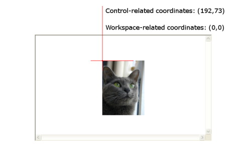
Lets consider left-top corner coordinates of some image. This image is zoomed out and aligned to center horizontally and to center vertically:
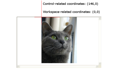
If we zoom this image in and change the alignment, its workspace-related coordinates will not be changed. Whereas its coordinates inside the control will be changed:
Workspace dimensions are equal to dimensions of the image loaded in the BitmapViewer. Therefore, you can use this image dimensions to determine height and width of the workspace. Also, you may use WorkspaceHeight and WorkspaceWidth properties for these purposes.